A grid is a promise.
We build invisible architecture that guides the eye, reduces cognitive load, and turns complex information into clear decisions.
- → 8pt baseline rhythm
- → Mobile-first, desktop-perfect
- → Zero visual noise
Structure as Art
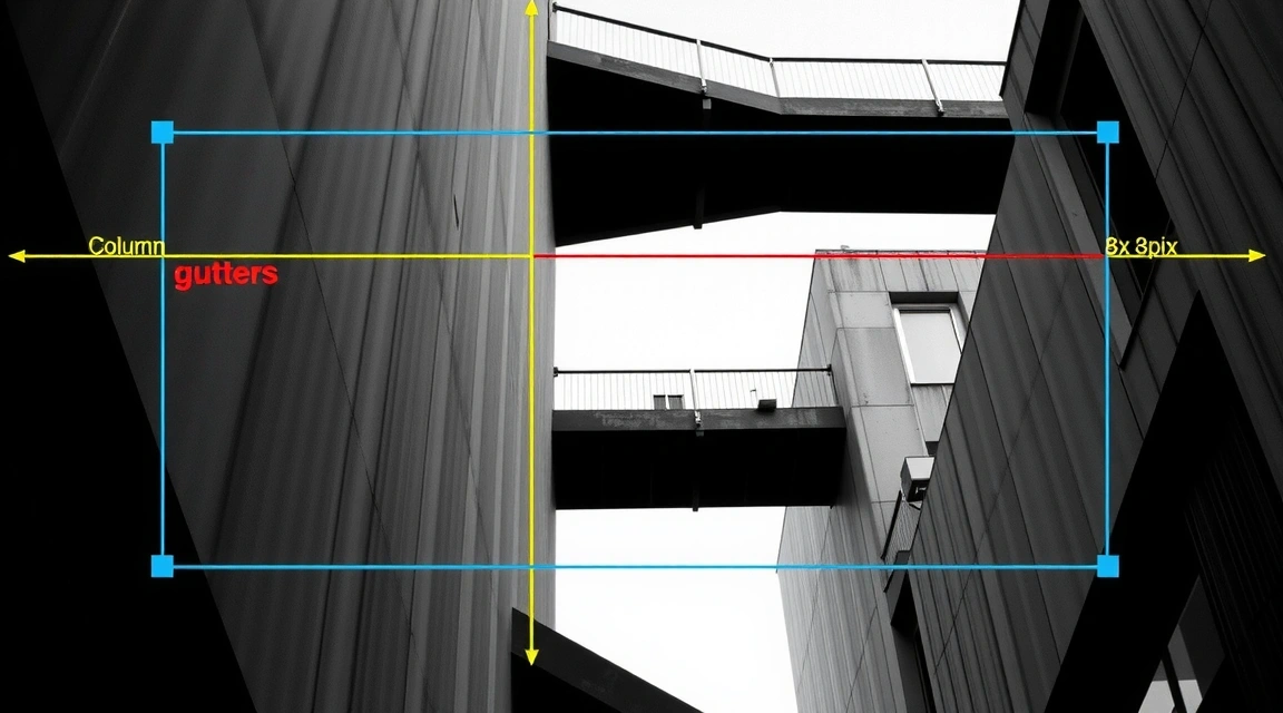
The most common mistake in modern web design is treating the grid as a cage. We see it as a promise—a silent agreement between the interface and the user that everything has its place. By building on an 8-pixel baseline, every line height, padding value, and margin falls into a vertical rhythm that feels inevitable. It’s not about rigid columns; it’s about creating a visual tempo that reduces eye-scans and accelerates understanding.
A financial dashboard and a fashion storefront might share the same 12-column skeleton, but their breathing room differs wildly. One demands density and precision; the other requires space and focus. Our job is to calibrate that tension—knowing when to pack in data and when to let a product image breathe. This is the invisible scaffolding behind the final polish.
"Whitespace is an active design element, not a passive absence of content."
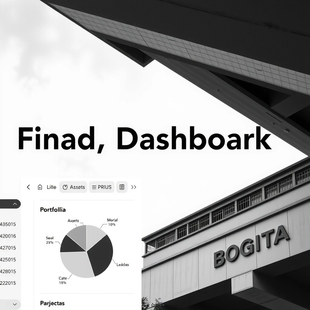
Project: FinTech Nova
Real-time trading platform for a Swiss bank. 50+ data points. One screen.
The Challenge
Display volatile market data without overwhelming the trader. The client's legacy UI required 12+ eye-scans to find a single metric. Cognitive load was high; reaction time was slow.
Decision
Progressive Disclosure. Hover to reveal secondary metrics.
Trade-off
Speed over Detail. Monospaced fonts for key numbers only.
USER FEEDBACK:
"I can scan my portfolio in 3 seconds now."
— Beta Tester, Zurich
Constraint Note
No custom fonts. Inter was mandated to ensure maximum legibility on high-DPI screens and sub-200ms load times on legacy banking terminals.

Terminology & Viewpoint
Progressive Disclosure
Revealing complexity only when needed. It’s not about hiding info; it's about respecting the user's attention span.
Sticky Element
A UI component that remains fixed while scrolling. We use it sparingly—only for primary actions like "Add to Cart" or "Submit Form".
Thumb Zone
The physical area of a mobile screen easily reachable by a thumb. Designing for this means placing critical CTAs in the bottom third.
The Golden Path
The ideal user journey from entry to conversion. It’s rarely a straight line, but it should always feel like progress.
Guiding the Hand
E-commerce isn't just about pretty product photos. It's a tactile exchange. We design for the user on a train with one hand, scrolling with a thumb. Every tap target must be large enough, every sticky button must stay in view. The "Hover State as a Promise" tells the user: "Yes, this is interactive. Tap me."
Bogotá Studio
We are a collective of 5 specialists rooted in the rhythm of the Andes. The architecture of Bogotá—the sharp angles, the dense urban texture—directly informs our approach to digital layout.
 Workshop
 Architecture
 Process
We don't sell websites. We sell clarity. Our grids are engineered to reduce cognitive load, accelerate user decisions, and ground your digital presence in a system that scales. Global reach, local discipline.