1. The "Bootstrap Trap"
Using default frameworks without customization leads to generic, forgettable layouts. Users recognize template patterns subconsciously, which lowers trust. We customize the grid to the content, never the reverse.
The grid is not a constraint; it is a cognitive tool that guides the eye, builds authority, and transforms chaotic content into premium architecture.
Brands using systematic grid architecture register 40% higher perceived value in first-visit tests. It’s not magic; it’s mechanics. A grid organizes information into a scanning path, reducing cognitive load. When a user lands on your pricing page, the grid aligns features, testimonials, and calls-to-action into a single, fluid reading rhythm.
Consider the "Bootstrap trap." Using default frameworks without customization leads to generic, forgettable layouts. We don't borrow templates; we draft systems. The rigidity of the grid allows for fluid creativity within defined boundaries—like a sonnet allows for poetic genius.
"Without a grid, mobile layouts fragment. With a grid, they adapt."
We refuse projects that skip Layer 1. It's like building a house without a foundation.
CSS Grid + Fallbacks. The invisible skeleton that holds the weight.
Typographic Scale 1.25 ratio. Whitespace is active silence.
Micro-interactions + State Changes. Responsive behavior.
Chaotic layout, variable padding, unreadable on 320px devices. Average session: 45s.
Aligned components, fixed rhythm, fluid typography. Average session: 2.3x increase.
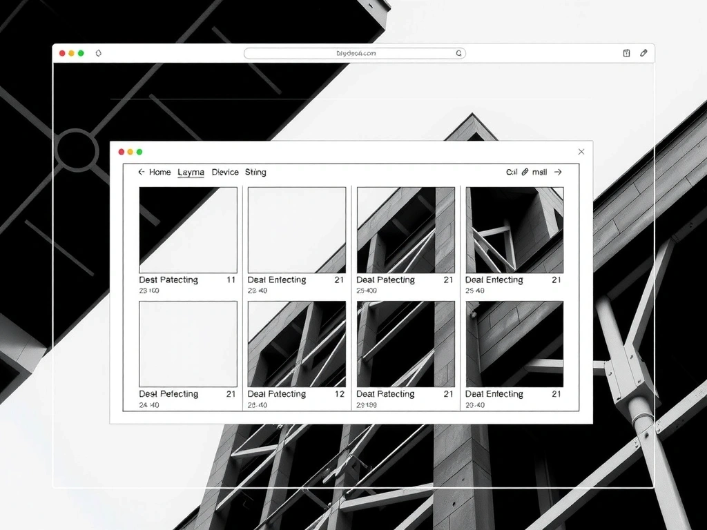
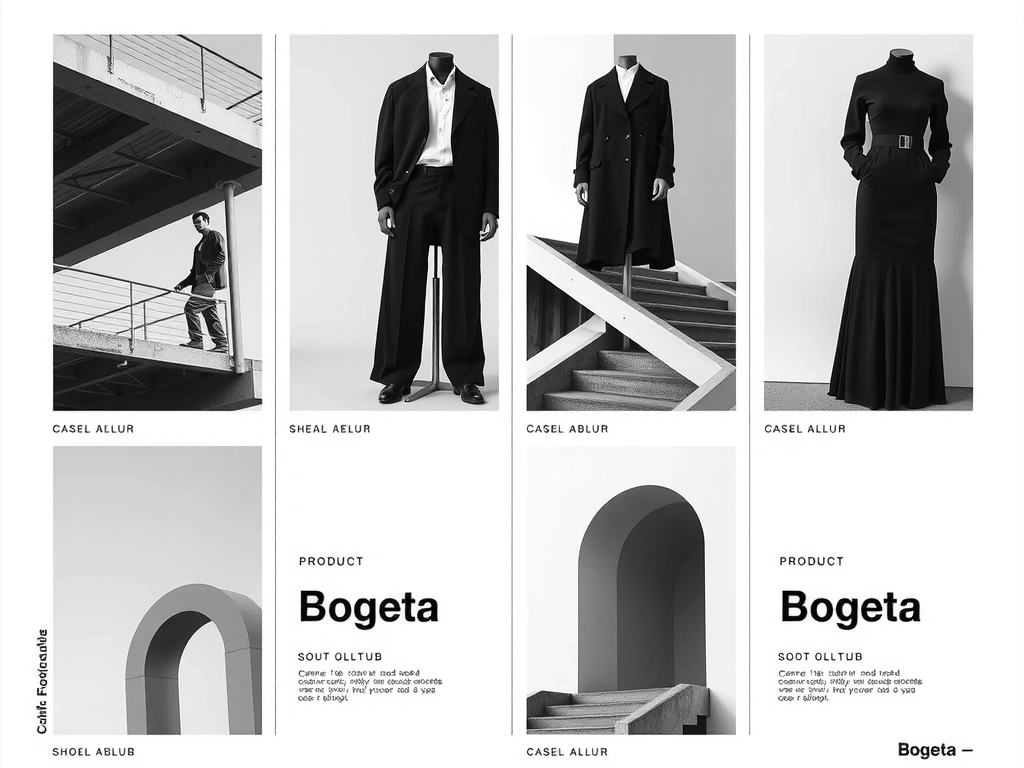
We don't show work that hasn't passed our internal Grid Audit. Below is visual evidence of the system applied to real constraints.
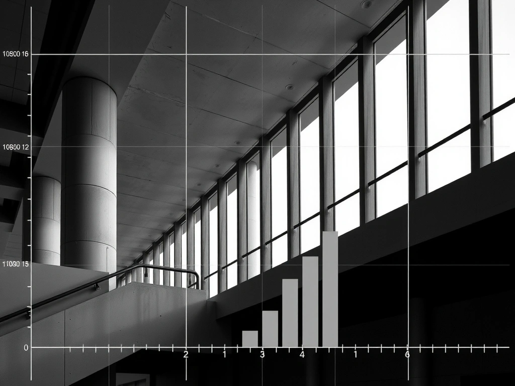
Reduced cognitive load by 35%.
18% increase in mobile conversion.
Using default frameworks without customization leads to generic, forgettable layouts. Users recognize template patterns subconsciously, which lowers trust. We customize the grid to the content, never the reverse.
A grid that looks perfect at 1920px often fails at 320px. We audit every module at extreme widths. If the grid breaks, the system is weak.
Designing for "pretty" ignores the cognitive science of scanning. A grid must support the eye's movement, not just decoration.
Not empty space; it's active silence that frames the message. A crowded grid is a screaming grid.
Typography that scales by ratio (1.25), not just viewport. Keeps hierarchy intact across devices.
If you squint and the layout blurs into gray blocks, the grid is weak. Strong grids hold structure even when blurred.
Price locked at project start. No hourly creep. We price the system, not the minutes.
Carrera 9 #115-06, Bogotá, Colombia
Predictable phases. No surprises. If you skip the Audit, you keep the cracks.
We analyze your current site and deliver a 3-page report detailing structural failures.
We build the grid and typographic system specific to your brand architecture.
We plug content into the grid, page by page. Strict adherence to the system.
Monitor performance and refine the grid. We hand over the keys; no retainers required.